MedEngine is a medical technology company based in Berlin focusing on improving the lives of people with Parkinson’s. I joined the team at an early stage as their in-house industrial designer to design apps and devices for consumer and clinical use.
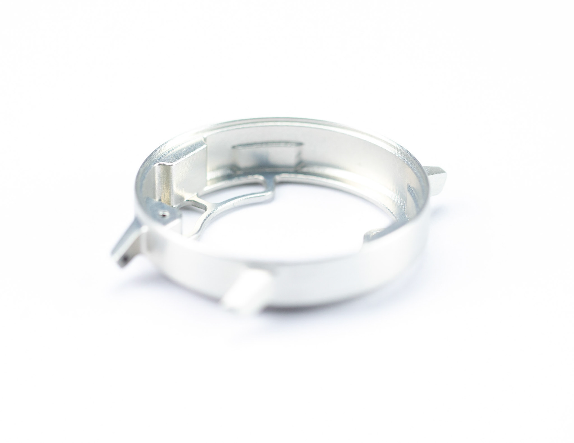
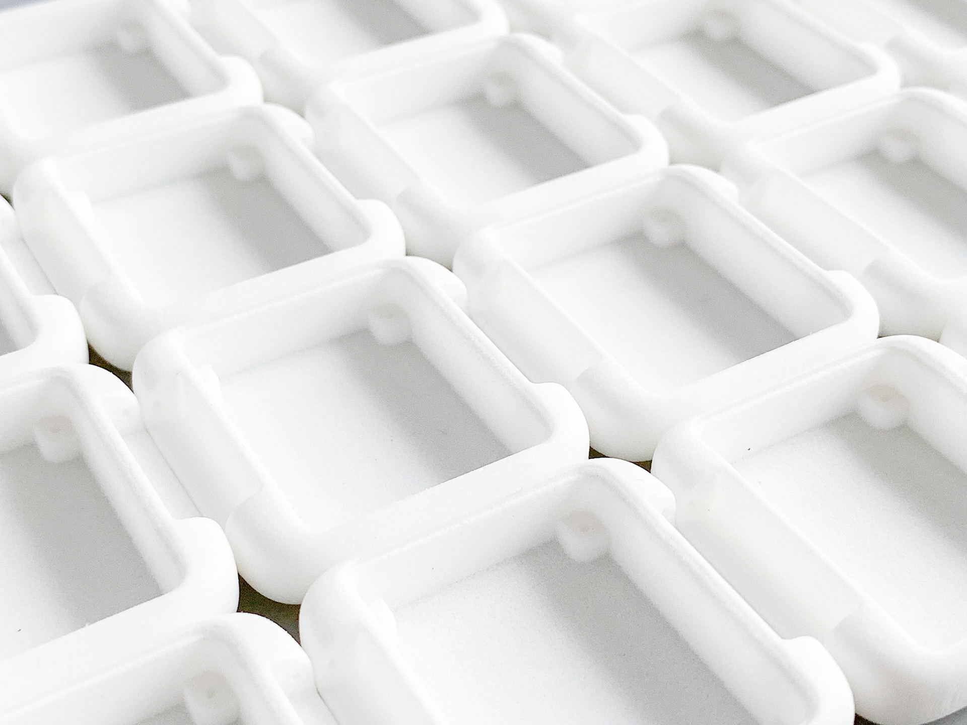
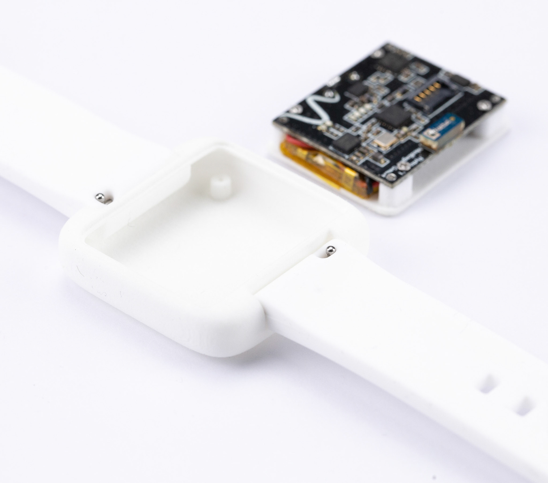
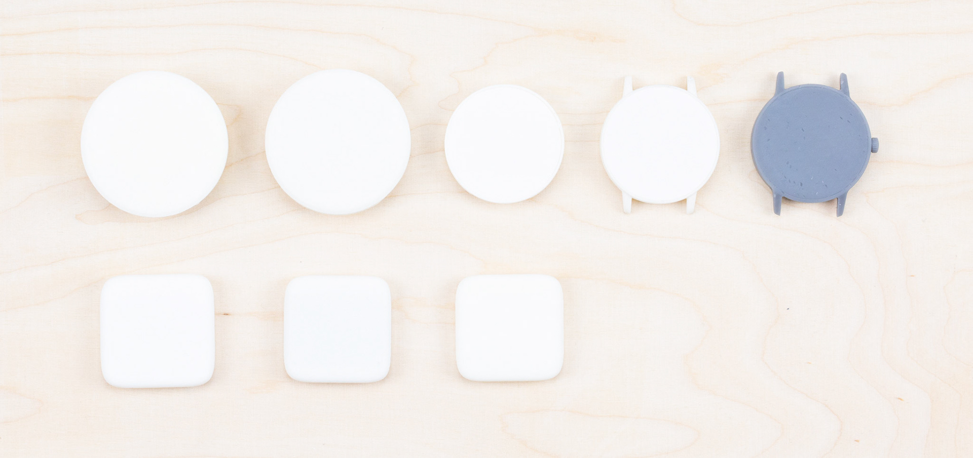
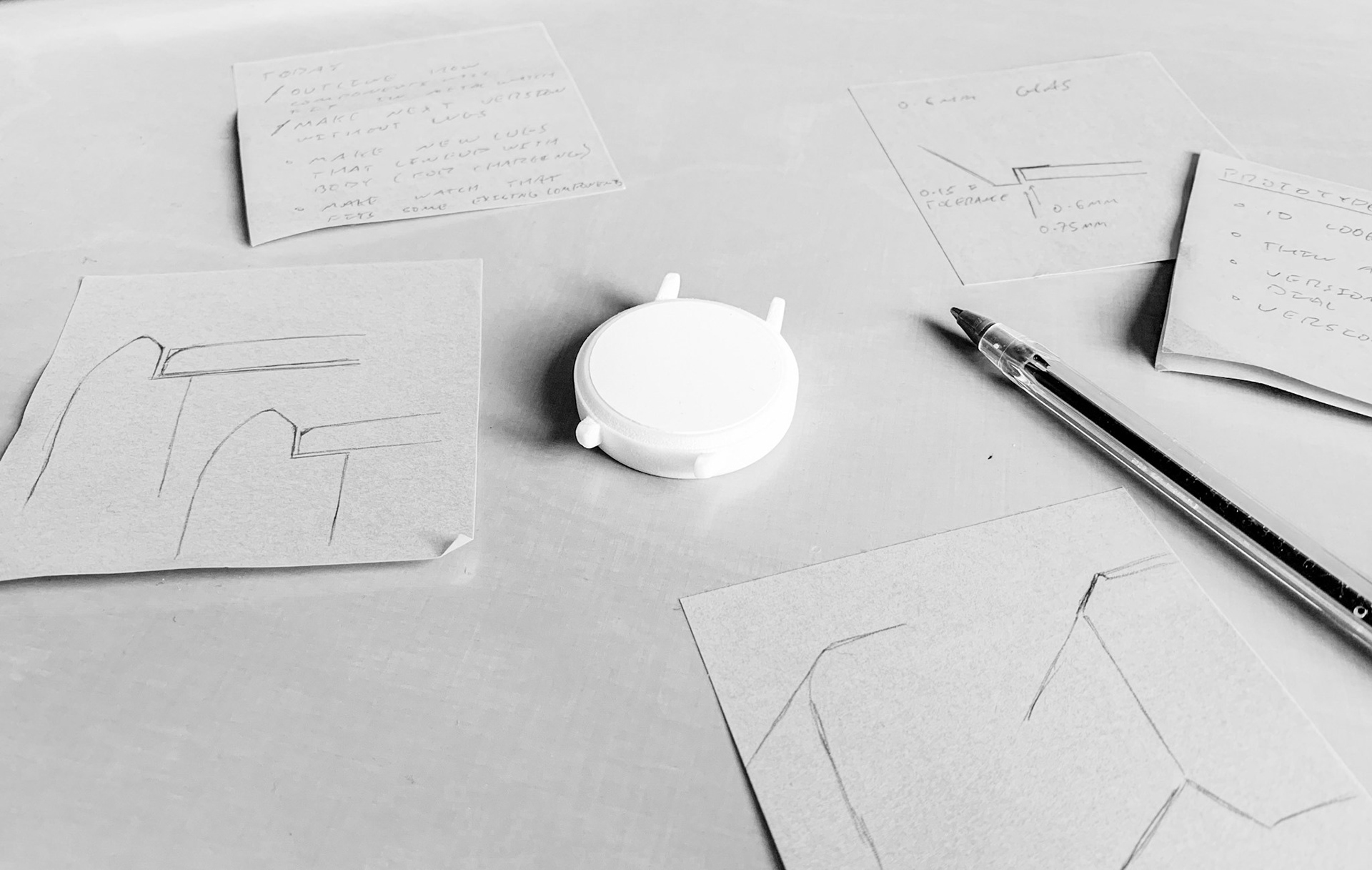
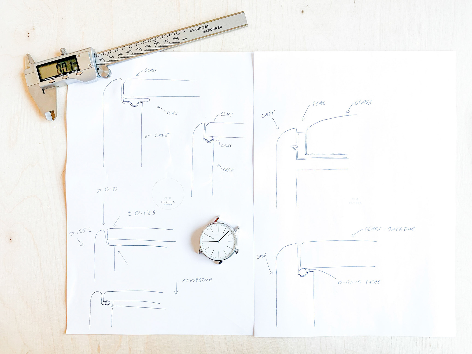
During the early stages of product development, 3D prints were an essential prototyping tool. The tech packages developed at a nearly biweekly rate which necessitated agile changes in the enclosures. With SLS we could create high quality prototypes very quickly, but, perhaps even more importantly, they were also strong enough to be functional. Once received, the prototypes could be paired up with a simple watch strap and the tech package and could then be field tested nearly instantaneously.
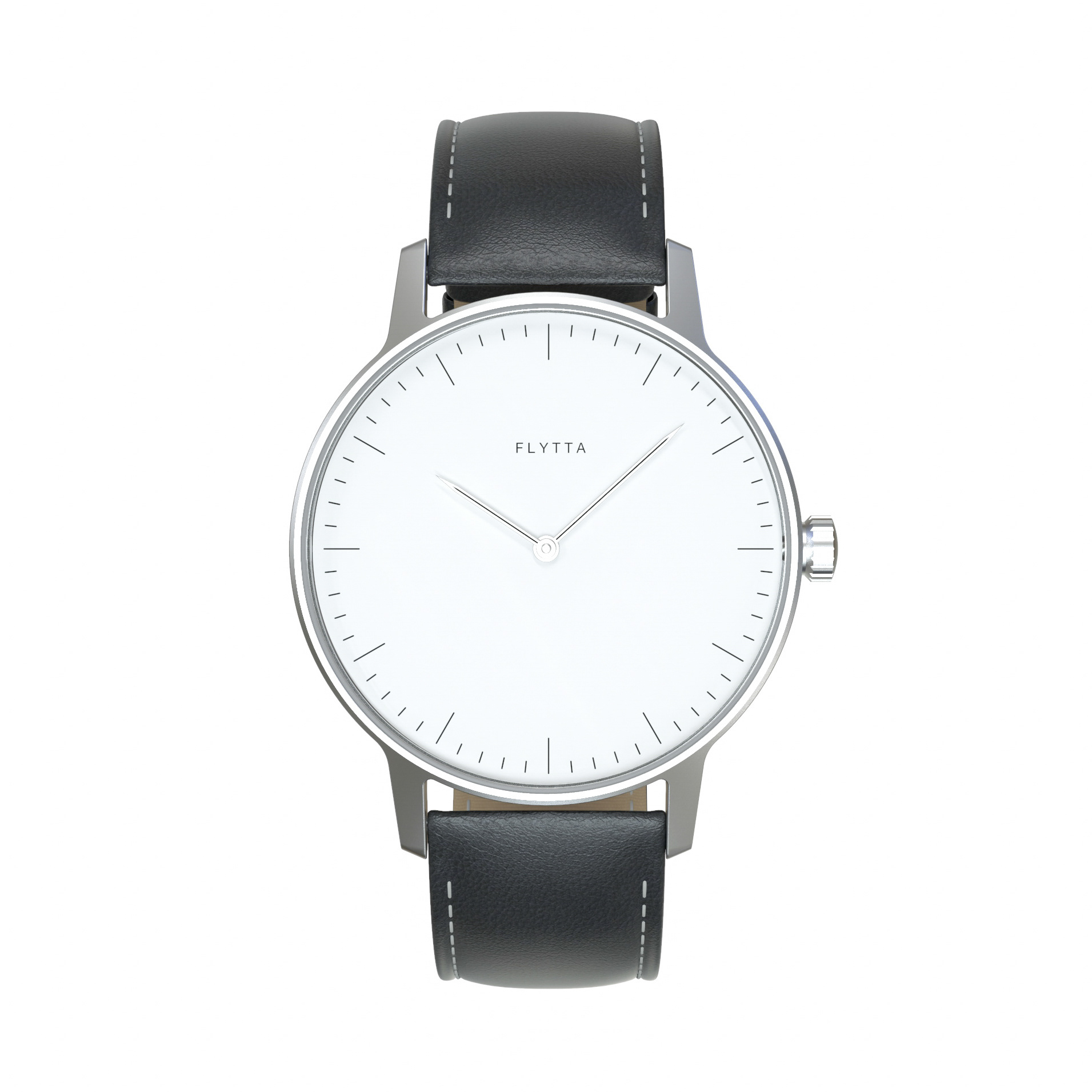


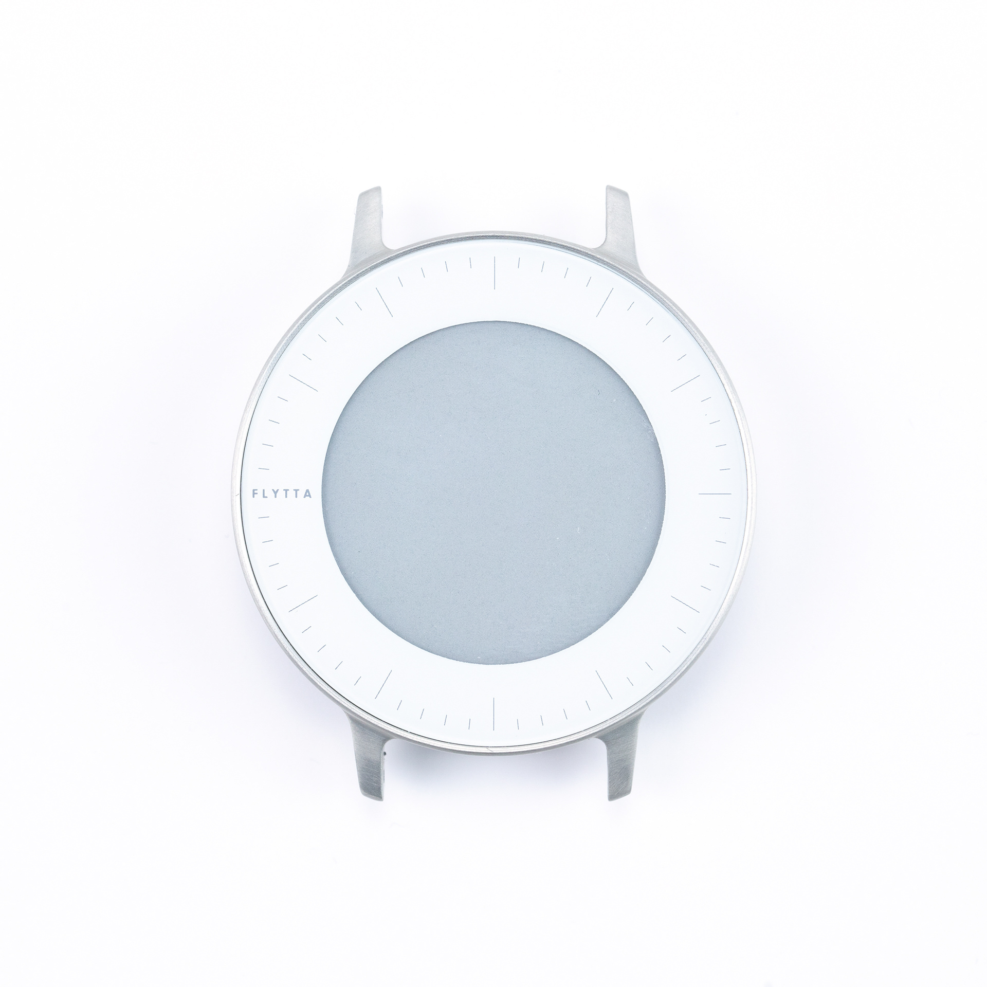
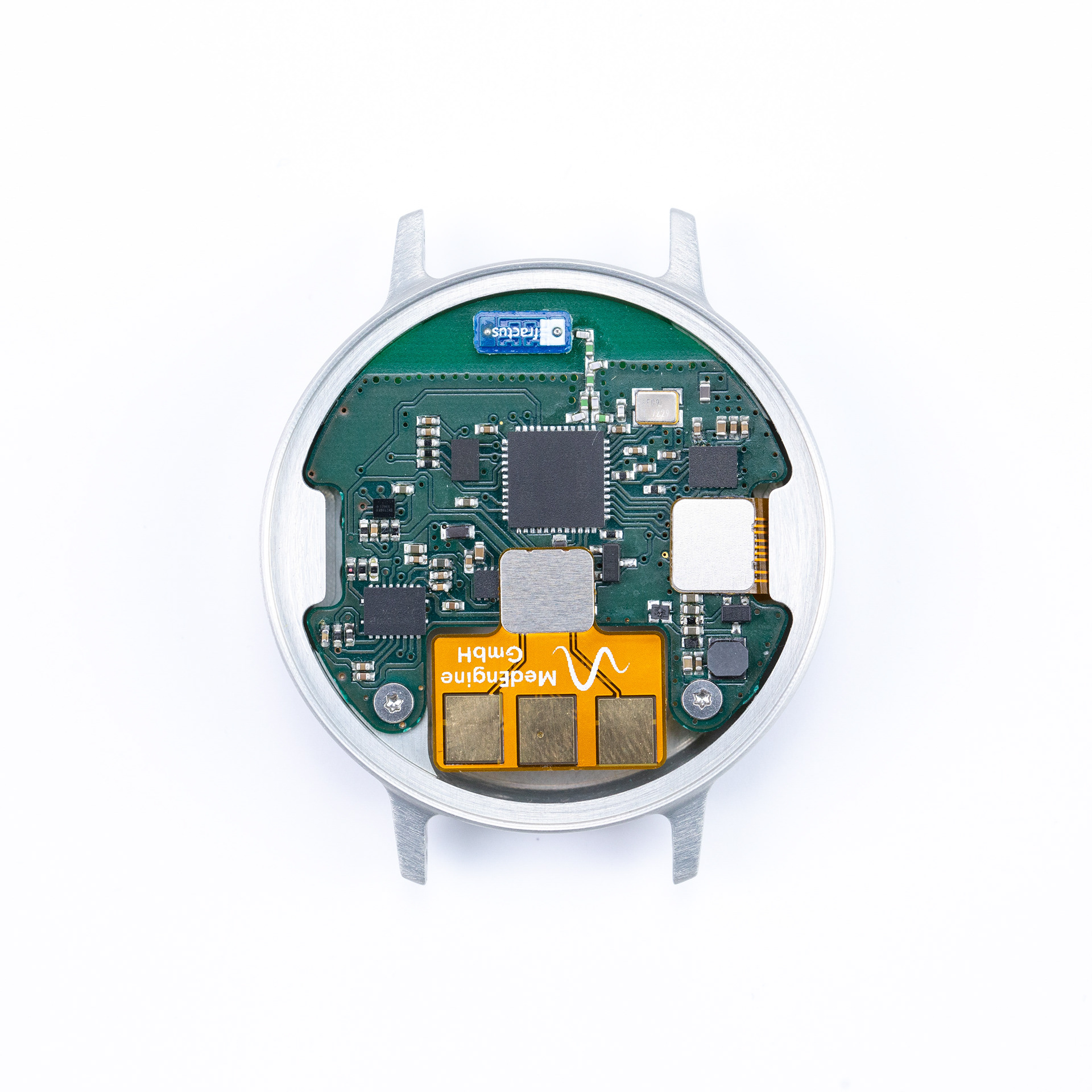
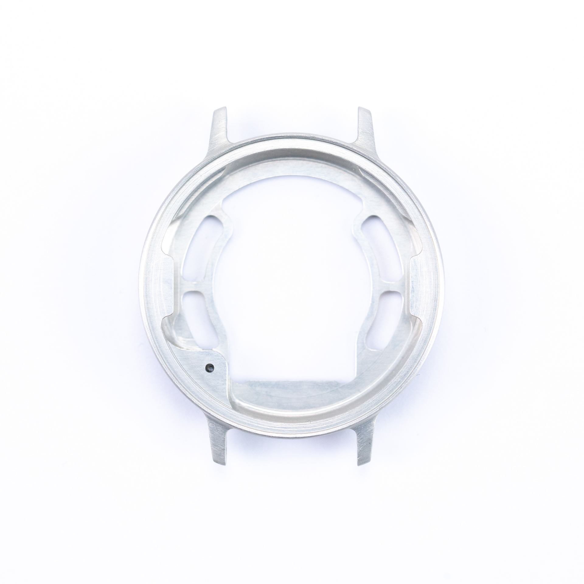

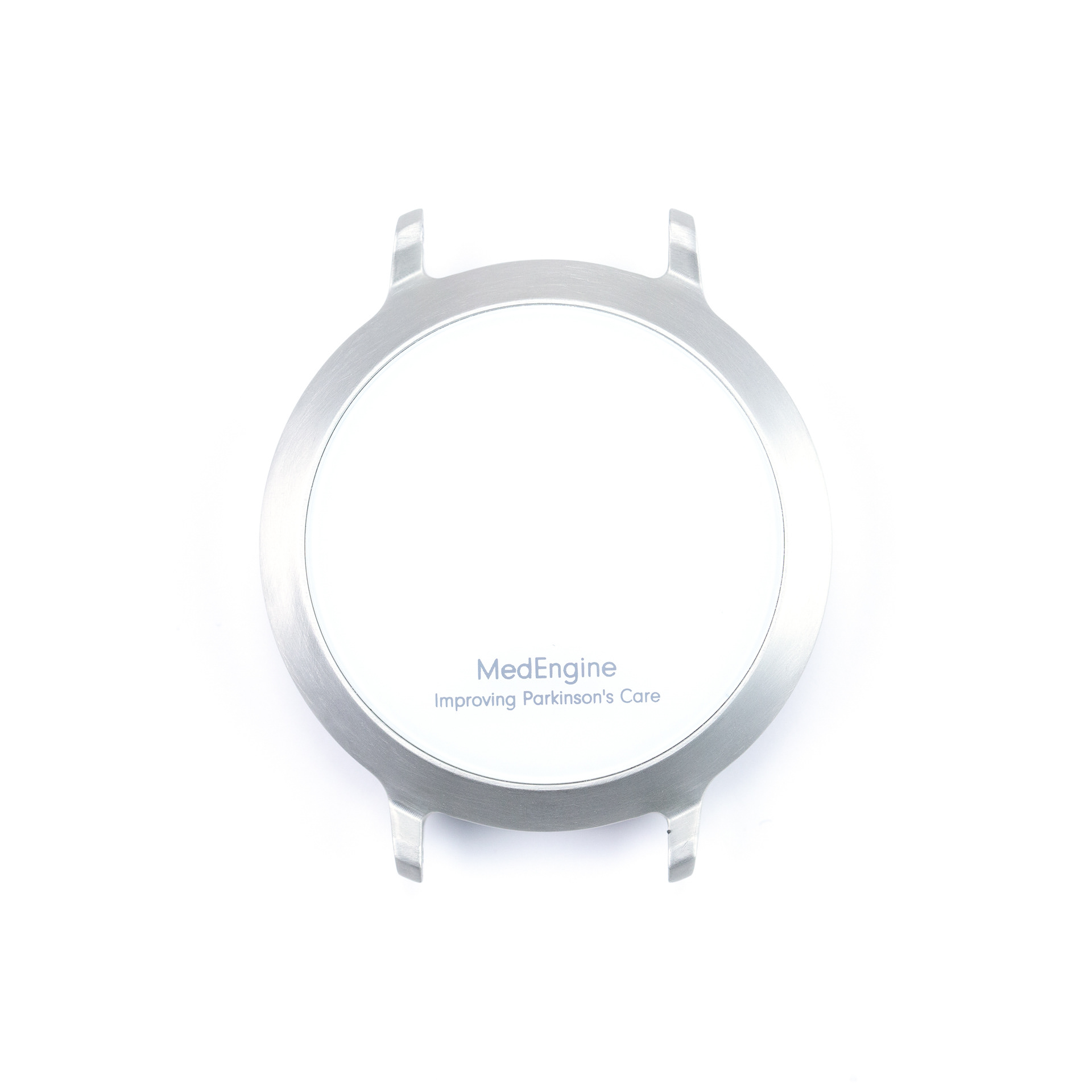
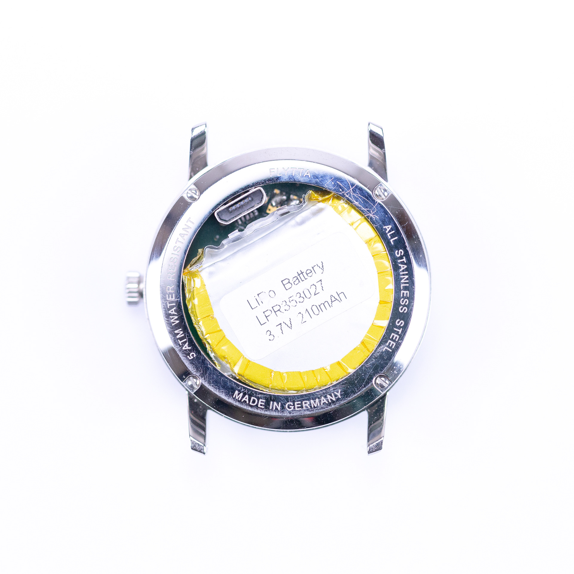
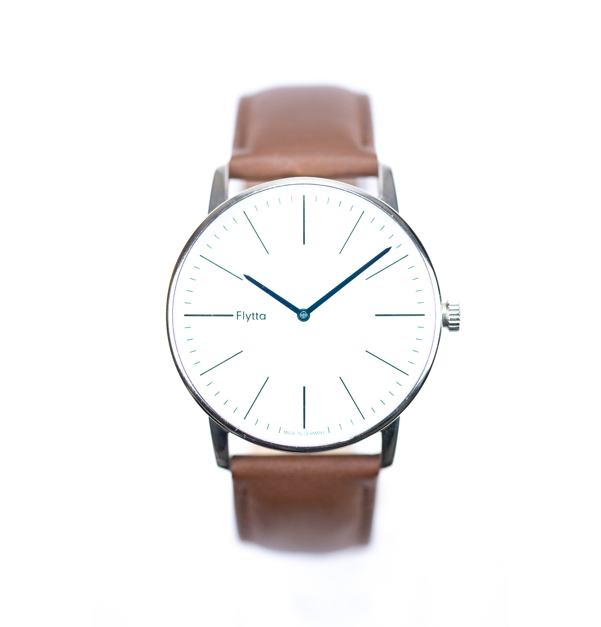
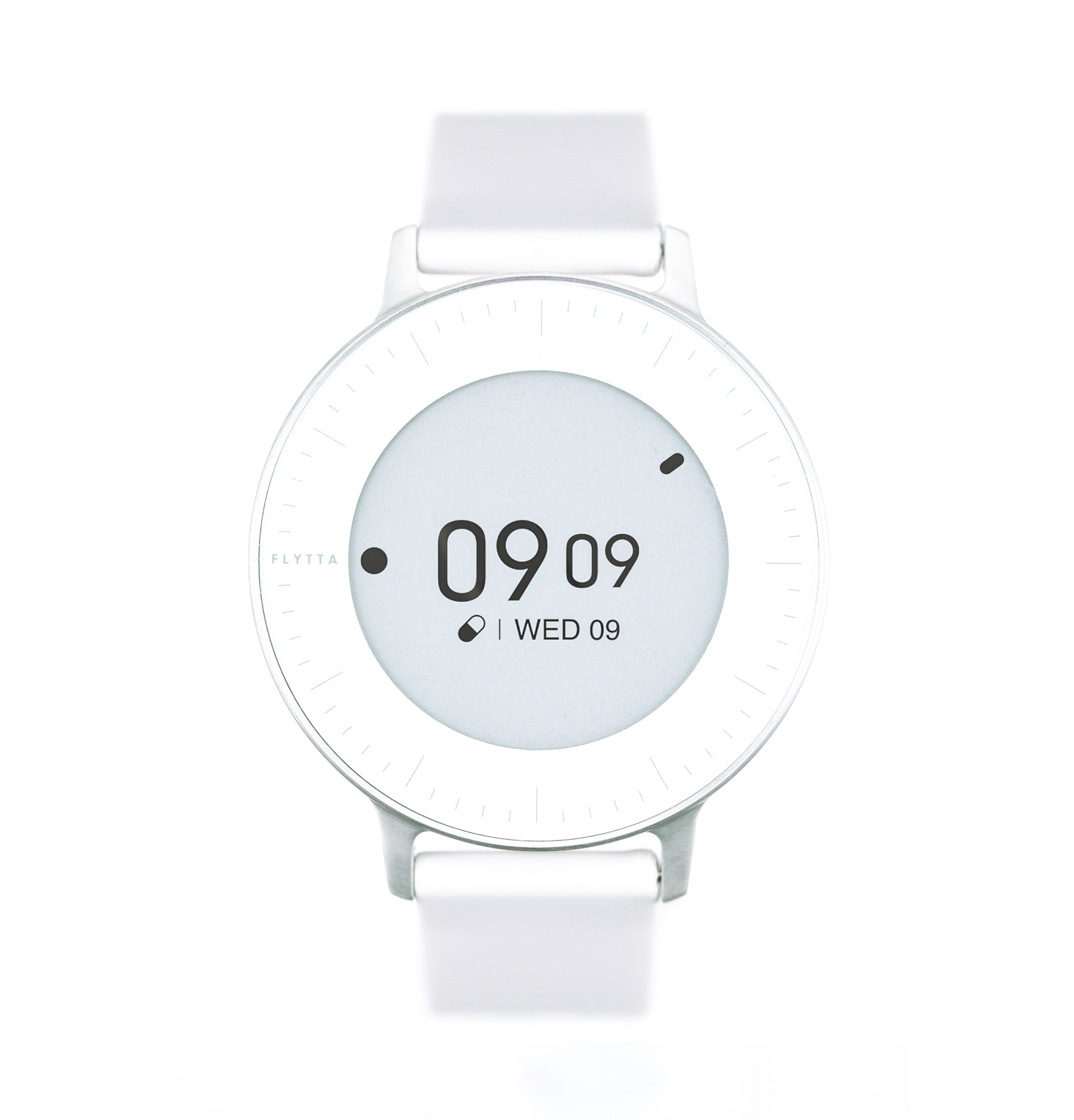
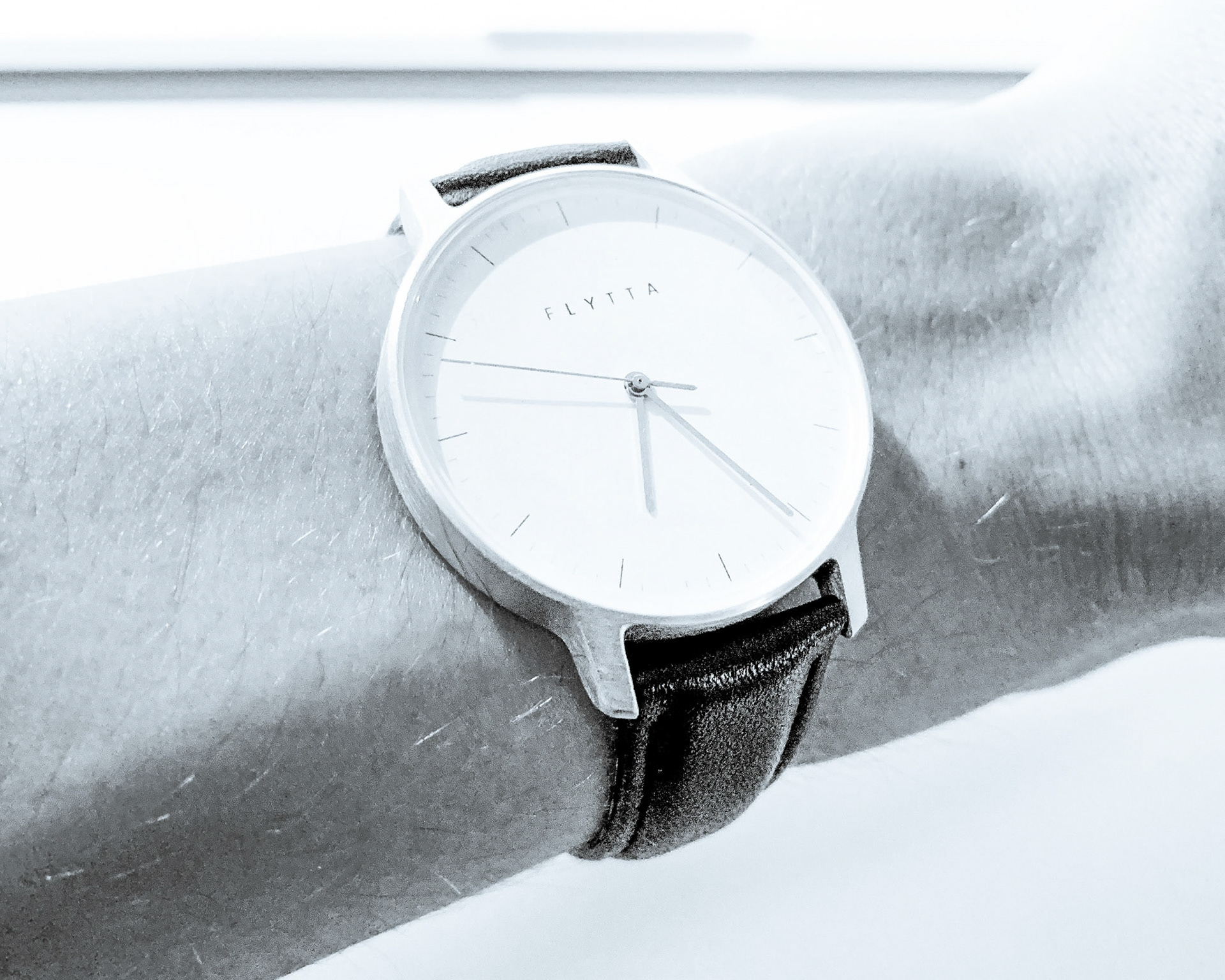
As development of the wearables continued we conducted various research discussions with our target audience during which the main driver of the final consumer device crystallised: we wanted to build a smart watch with medical functionality that didn’t look medical, or even too high tech. The most valuable moment for us was when a user told us about the apprehension she had about wearing a competitors product as it was large, cumbersome, noisy and most importantly outed her as being sick. In response to seeing our prototype she said “wow, my husband would wear this”.
The greatest validation for me during this project is the potential of using my industrial design skills to improve people’s quality of life. With this project the company made it on the list of the top 100 startups in Germany in 2018 and received funding from the European Union.



The Apps
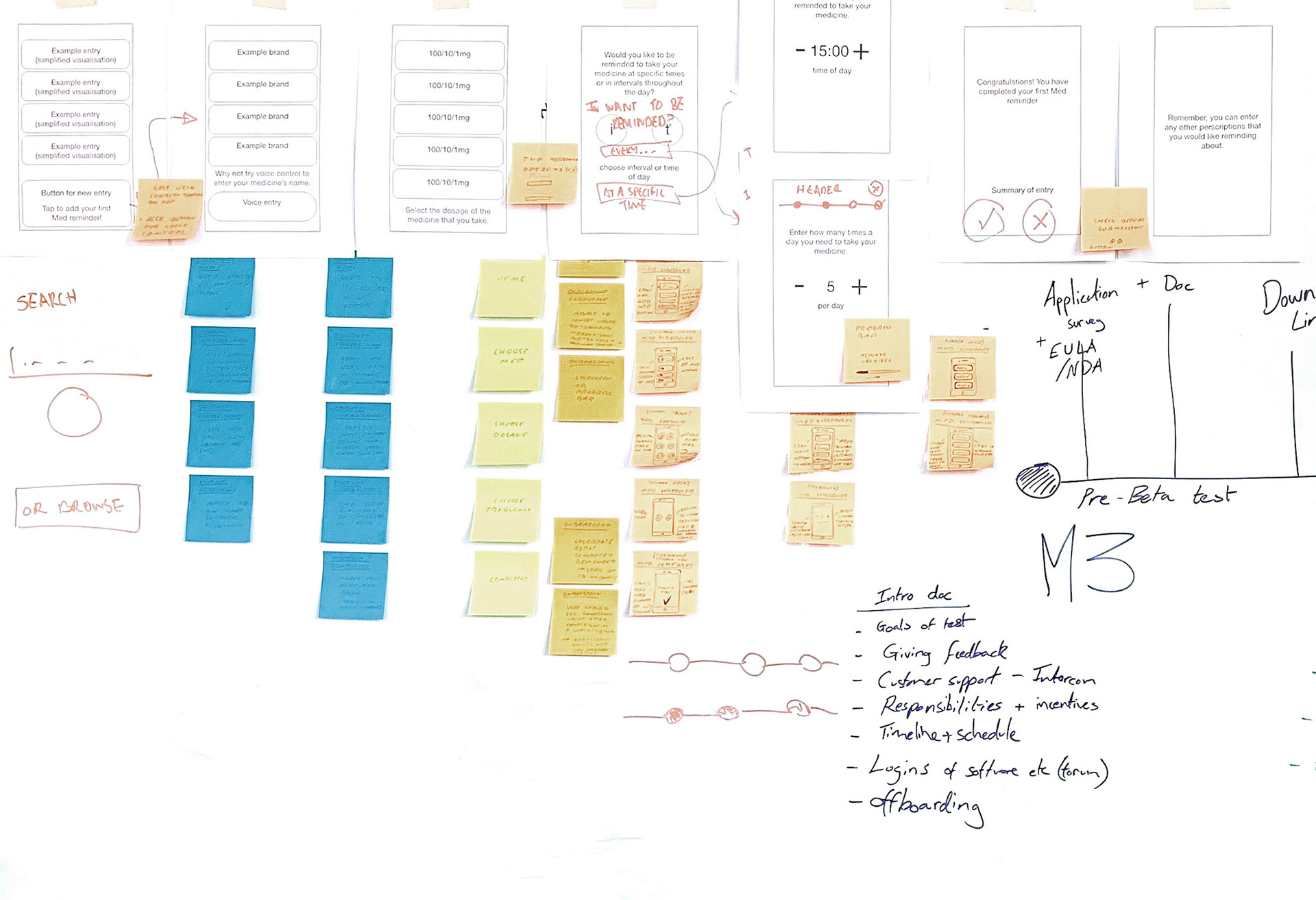
The Flytta app was also developed from the ground up. Visually it had to be very clean and legibility was a key requirement. Some of the central functionality around the integration of the data collected by the wearable was known from the outset, however through dozens of user interviews and research trips more insight was gathered that informed more patient centric features. Some of these new areas within the app included a user diary and a medication scheduler. The data gathered from the wearable and the insights synthesised with it are displayed in cards on the home screen.
New features would be wire-framed initially and then turned into mockups and testable prototypes. These prototypes would then be a/b tested with users until finally being developed into high fidelity UI.
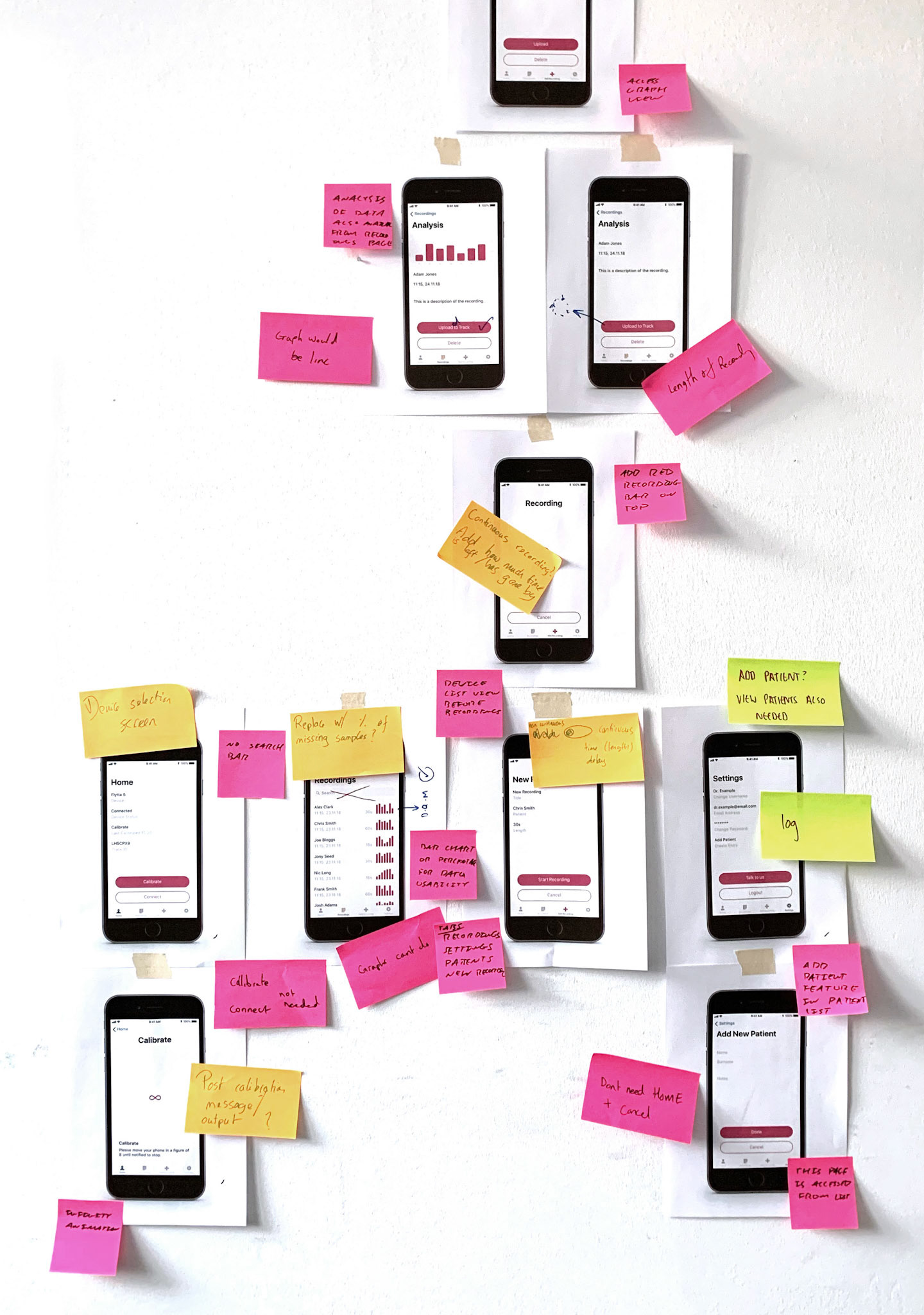
For clinical use, I also worked on an app called Hitta which clinicians used during studies, together with the Flytta wearables that we were providing. As this app was made for a very different user and use case, the end result became more functional by allowing the clinician deep control over all kinds of recording parameters and device settings from within the app.
